A month ago, The Globe and Mail ran an article entitled Most Canadians want Elizabeth May at leaders’ debate, poll shows. It presented the results of a poll showing most Canadians supported Elizabeth May’s inclusion in the leaders’ debate. The article was unremarkable.
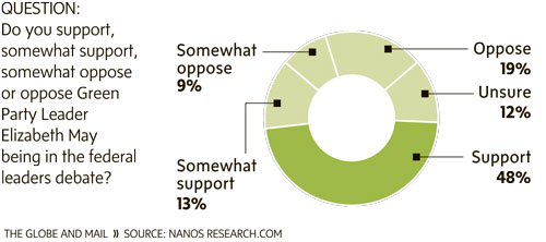
The chart that accompanied it, however, was remarkably bad:

First, the graph uses a donut chart — which is basically a pie chart — which is a terrible idea to start with. The chart is made worse by using only two colours: dark green and light green.
- Dark green represented “support.”
- Light green represented “somewhat support,” “somewhat oppose,” “oppose” and “unsure.”
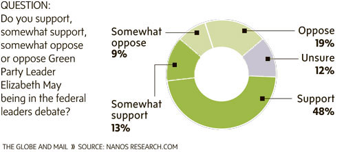
If you casually glanced at the graph—and the headline—you’d get the impression 52% of Canadians opposed May’s inclusion in the debates. Not only does this contradict the article’s headline, it’s also false. In fact, only 28% of Canadians opposed May’s inclusion in the debates.
A small tweak conveys the message better:
